
Tutorial
In this 1 hour long tutorial, we’ll build a simple, cross-platform app that targets iOS, Android, and Web.
Our stack will be Expo, Reanimated, and of course Unistyles for powerful, performant styling.
During this tutorial, we will cover most of the Unistyles features and best practices.
Create new project
First, let’s scaffold a new Expo project using the command line:
npx create-expo-app@latest unistyles-tutorialcd unistyles-tutorialNext, install Unistyles, its dependencies, and Reanimated:
yarn add react-native-reanimated react-native-unistyles react-native-nitro-modules react-native-edge-to-edgeFinally, generate the native project folders required for the app to run:
yarn expo prebuild --cleanConfigure Babel Plugins
Both Unistyles and Reanimated require a Babel plugin to work. Since a babel.config.js file isn’t created by default, we can generate it by running:
npx expo customize babel.config.jsNow, add the unistyles and reanimated plugins to your babel.config.js:
module.exports = function (api) { api.cache(true); return { presets: ['babel-preset-expo'], plugins: [ ['react-native-unistyles/plugin', { root: 'app' }], ['react-native-reanimated/plugin'] ] };};Modify app entry point
To use features like themes and breakpoints, Unistyles must be configured before your application code runs. This ensures that all stylesheets are created with the correct theme and device context.
First, update your package.json:
{ "main": "expo-router/entry" "main": "index.ts"}Next, create a new index.ts file in your project’s root directory. This file will load the standard Expo Router entry point, and then import your Unistyles configuration:
import 'expo-router/entry'import './unistyles'We’ll create the unistyles.ts file in the next step.
Configure Unistyles
This is where the magic happens! Create a unistyles.ts file in your project’s root. Here, we’ll define our themes, breakpoints, and register them with Unistyles.
import { StyleSheet } from 'react-native-unistyles'
const lightTheme = {    colors: {        background: '#FCFAF8',        foreground: '#EDEAE6',        typography: '#1B140C',        dimmed: '#ECE8E4',        tint: '#9A734C',        activeTint: '#1B140C',        link: '#1E3799',        accents: {            banana: '#F6E58D',            pumpkin: '#FFBE76',            apple: '#FF7979',            grass: '#BADC58',            storm: '#686DE0'        }    },    gap: (v: number) => v * 8,} as const
const darkTheme = {    colors: {        background: '#221A11',        foreground: '#332618',        typography: '#FFFFFF',        dimmed: '#A8A198',        tint: '#C9AD92',        activeTint: '#FFFFFF',        link: '#0C2461',        accents: {            banana: '#f9CA24',            pumpkin: '#F0932B',            apple: '#EB4D4B',            grass: '#6AB04C',            storm: '#4834D4'        }    },    gap: (v: number) => v * 8,} as const
const appThemes = {    light: lightTheme,    dark: darkTheme}
const breakpoints = {    xs: 0,    sm: 300,    md: 500,    lg: 800,    xl: 1200,}
type AppBreakpoints = typeof breakpointstype AppThemes = typeof appThemes
declare module 'react-native-unistyles' {    export interface UnistylesThemes extends AppThemes {}    export interface UnistylesBreakpoints extends AppBreakpoints {}}
StyleSheet.configure({    settings: {        adaptiveThemes: true    },    themes: {        light: lightTheme,        dark: darkTheme,    },    breakpoints,})
That’s a lot to take in, so let’s break it down:
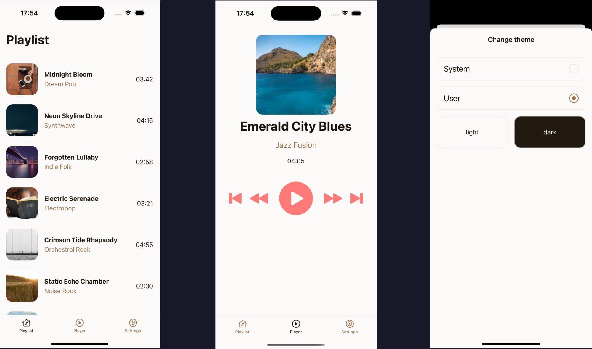
Themes: We defined light and dark themes. There are no restrictions on a theme’s structure, you can add any properties you need, from colors to spacing functions.
In our case we defined a custom palette with different accents and one helper function gap for spacing.
Breakpoints: We defined a set of breakpoints for responsive design. The only requirement is that one breakpoint must be 0.
Types: We extended the Unistyles module with our custom AppThemes and AppBreakpoints types. This is the key to unlocking full auto-completion and type-safety across your entire app.
Configuration: Finally, we called the StyleSheet.configure function to set all the options. We also enabled adaptiveThemes, which will cause Unistyles to automatically transition between themes based on device color scheme.